TB Lightning: Ranking every alternate jersey in team history

Nov 3, 2022; Tampa, Florida, USA; Tampa Bay Lightning center Brayden Point (21) skates with the puck against the Carolina Hurricanes during the second period at Amalie Arena. Mandatory Credit: Kim Klement-USA TODAY Sports
4 of 8
Next

Bold or basic, there is seemingly nothing in-between when it comes to the alternate jersey designs the Tampa Bay Lightning have worn in their history.

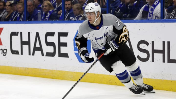
Thursday, the team debuted their reverse retro 2.0 jerseys inspired by the original alternate “storm” jersey. Tuesday was the first of six planned occasions that the team will don them this season (and likely ever), before the storm design returns to its rightful spot in franchise lore.

So, what better way to kick off the debut of the new reverse retros than by having all of our writers rank the seven alternate jersey designs in franchise history? We have the highest and lowest rankers providing their opinion for each jersey.

28 Oct 1998: Leftwinger Benoit Hogue #33 of the Tampa Bay Lightning looks on during the game against the Anaheim Mighty Ducks at the Arrowhead Pond in Anaheim, California. The Mighty Ducks defeated the Lightning 5-3. Mandatory Credit: Elsa Hasch /Allsport
28 Oct 1998: Leftwinger Benoit Hogue #33 of the Tampa Bay Lightning looks on during the game against the Anaheim Mighty Ducks at the Arrowhead Pond in Anaheim, California. The Mighty Ducks defeated the Lightning 5-3. Mandatory Credit: Elsa Hasch /Allsport /

7. Storm (1996-99)

Noah: 7, Garrett: 5, Stephen: 5, Henry: 7

Garrett: While I do think that these are slightly better than the recently released remodeled version of them, these jerseys are just kind of meh to me. The Lightning bolts on the side with the blue is a nice combo, but to me they just kind of have too much going on.

Henry: Let’s face it, the original storm jerseys were so bad, they were almost awesome. There’s a reason why these are put in a group with some of the worst jerseys in NHL history. They were so bad and short lived that they’ve long just become a bit of a meme in the organization’s history.

Nov 3, 2022; Tampa, Florida, USA; Tampa Bay Lightning center Steven Stamkos (91) against the Carolina Hurricanes during the second period at Amalie Arena. Mandatory Credit: Kim Klement-USA TODAY Sports
Nov 3, 2022; Tampa, Florida, USA; Tampa Bay Lightning center Steven Stamkos (91) against the Carolina Hurricanes during the second period at Amalie Arena. Mandatory Credit: Kim Klement-USA TODAY Sports /

6. Reverse Retro 2.0 (2022-23)

Noah: 5, Garrett: 7, Stephen: 1, Henry: 4

Stephen: My initial reaction to Garrett, Henry, and Noah was “omg they’re horrendous.” I stand by that assessment, but they are so bad in a bold way that I have no choice but to love them.

Even the Lightning Twitter admin knows…

The lighter color palette, than the original, helps mellow some of the craziness going on with the design, and ultimately allows this to be my favorite.

Garrett: These jerseys just don’t do it for me. I think that they are a very basic attempt by Adidas to create a reverse retro and they essentially just threw together the original blue “storm” jersey and made it white. They could have done so much more with the reverse retro this year given the Bolts color scheme/past uniforms and I think that these are just very bland and forced in a way compared to the other alternates we have had.

Nov 13, 2021; Tampa, Florida, USA; Tampa Bay Lightning center Steven Stamkos (91) looks to pass the puck in the third period against the Florida Panthers at Amalie Arena. Mandatory Credit: Nathan Ray Seebeck-USA TODAY Sports
Nov 13, 2021; Tampa, Florida, USA; Tampa Bay Lightning center Steven Stamkos (91) looks to pass the puck in the third period against the Florida Panthers at Amalie Arena. Mandatory Credit: Nathan Ray Seebeck-USA TODAY Sports /

5. Disrupt The Night (2018-2022)

Noah: 3, Garrett: 6, Stephen: 6, Henry: 1

Henry: I love the disrupt the night jerseys. I’ll concede that it’s hard to tell names and numbers from TV and the press box. But I think the all stealth setup was truly unique and made a fun twist on the Lightning’s history of wearing black with a very modern feel.

Garrett: The disrupt the night jerseys just have never done it for me. I think they are very plain and don’t have any real redeeming qualities about them other than the fact that they are an alternate. I am personally a much bigger fan of the older black jerseys with “BOLTS” across the chest. I think when the NHL made the switch to Adidas, they could’ve done a lot more with a black alternate for us than they did.
NASHVILLE, TENNESSEE – FEBRUARY 26: Victor Hedman #77 of the Tampa Bay Lightning interacts with fans while leaving the stadium after the 2022 Navy Federal Credit Union NHL Stadium Series between the Tampa Bay Lightning and the Nashville Predators at Nissan Stadium on February 26, 2022 in Nashville, Tennessee. The Tampa Bay Lightning defeated the Nashville Predators 3-2. (Photo by Frederick Breedon/Getty Images)
NASHVILLE, TENNESSEE – FEBRUARY 26: Victor Hedman #77 of the Tampa Bay Lightning interacts with fans while leaving the stadium after the 2022 Navy Federal Credit Union NHL Stadium Series between the Tampa Bay Lightning and the Nashville Predators at Nissan Stadium on February 26, 2022 in Nashville, Tennessee. The Tampa Bay Lightning defeated the Nashville Predators 3-2. (Photo by Frederick Breedon/Getty Images) /

4. Stadium Series (2022)

Noah: 6, Garrett: 4, Stephen: 2, Henry: 3

Stephen: The oversized logo on the helmet is my only gripe. Otherwise, the subtle BOLTS design change to go with the lightning bolt on the bottom of the jersey makes for a simple yet effective design.

Noah: The stadium series jersey could’ve looked so much better, and while I do like the jersey, it’s one of my least favorite alternates the Lightning have had. The wording is too big on the front, the striping at the bottom could’ve looked a bit better, maybe with an outline on it, and overall, it just isn’t as good as the rest of the jerseys on this list besides our first storm jersey

December 6, 2008; Tampa FL, USA; Tampa Bay Lightning right wing Martin St. Louis (26) celebrates with teammates after scoring a goal against the Buffalo Sabres during the first period at St. Pete Times Forum. Mandatory Credit: Kim Klement-USA TODAY Sports
December 6, 2008; Tampa FL, USA; Tampa Bay Lightning right wing Martin St. Louis (26) celebrates with teammates after scoring a goal against the Buffalo Sabres during the first period at St. Pete Times Forum. Mandatory Credit: Kim Klement-USA TODAY Sports /

3. Blue BOLTS (2008-14)

Noah: 2, Garrett: 3, Stephen: 3, Henry: 6

Noah: I really like the look of the blue BOLTS jerseys, and while they’re not as clean as the black ones, they still look great. Many teams have attempted the diagonal wording on jerseys over the years and I think the Lightning were one of the best to do it

Henry: Ultimately, I’ve never been a big fan of having “BOLTS” on the jerseys. And this was by far my least favorite of the ones that did. The jersey was always boring to me and felt like it was weirdly stuck in between eras after the main Lightning jersey we know now was introduced at the start of the 2011 season.

TAMPA, FL – JANUARY 13: Nikita Kucherov #86 of the Tampa Bay Lightning reacts as members of the Columbus Blue Jackets celebrate a win at the Amalie Arena on January 13, 2017 in Tampa, Florida. (Photo by Mike Carlson/Getty Images)
TAMPA, FL – JANUARY 13: Nikita Kucherov #86 of the Tampa Bay Lightning reacts as members of the Columbus Blue Jackets celebrate a win at the Amalie Arena on January 13, 2017 in Tampa, Florida. (Photo by Mike Carlson/Getty Images) /

2. Black BOLTS (2014-17)

Noah: 1, Garrett: 1, Stephen: 7, Henry: 5

Noah: I’ve always loved the look of these jerseys and I’m a sucker for black jerseys. The Lightning know how to do a diagonal wording on their jerseys and if they brought these back as an alternate, I don’t think people would be too upset

Stephen: The colors never worked for me here. The return to black was a great idea but was executed poorly. They should have gone with the palm tree design they teased before unveiling these, but that’s a different story.

Mar 18, 2021; Tampa, Florida, USA; Tampa Bay Lightning defenseman Victor Hedman (77) is congratulated as he scores a goal against the Chicago Blackhawks during the third period at Amalie Arena. Mandatory Credit: Kim Klement-USA TODAY Sports
Mar 18, 2021; Tampa, Florida, USA; Tampa Bay Lightning defenseman Victor Hedman (77) is congratulated as he scores a goal against the Chicago Blackhawks during the third period at Amalie Arena. Mandatory Credit: Kim Klement-USA TODAY Sports /

1. Reverse Retro (2021)

Noah: 4, Garrett: 2, Stephen: 4, Henry: 2

Henry: I thought the first go around with the reverse retro was awesome. A great combination of history with the modern look. That old logo was important for this franchise and the blue jersey made for a fun way to modernize it.

Stephen: The fact that nobody voted for the reverse retro as their favorite, and it still ended up as number one, perfectly sums up its existence. The classic team colors paired with a simple design would have been hard to mess up.

Did we get the rankings right? Let us know in the comments below.

Next. Kucherov Rides Serious Hot Streak. dark

Next